
The Chicago based bike sharing company, Divvy, hosted a contest this past winter. They released anonymous ride data on over 750,000 rides taken in 2013. The contest had several categories to see who could draw the most meaning from these data and who could design the most beautiful representation of the rides. I entered the contest as a way to learn about D3.js, a new data visualization tool that is amazingly powerful. And complicated.
I thought it would be fun to see where most people were coming from and going to. When I start a play-project like this, I reach for my two favorite data analysis machetes, Postgres and Python. Cleaning and loading the data into Postgres was pretty straight forward, which lead to the fun part, trying to derive a meaningful framework with which to examine the ride data.
Pretty quickly it became apparent that breaking down the day into small time slices and aggregating the top departure points would yield interesting insights. It became even more interesting when you categorize the top departure points by their corresponding top destinations. 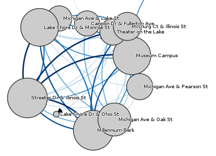
At different times of the day the pattern of rides looks wildly different. Early in the morning a massive influx of riders use Divvy bikes near the citys two main train stations. In the middle of the day, bike usage centers around the primary tourist attractions with everyone coming and going to the same places. And in the small hours of the morning the bikes serve as cab replacements in the neighborhoods with lots of bars. 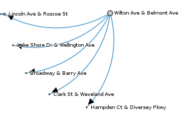
With the ride data extracted, I used D3 to make it beautiful. D3 allows shapes to move and change color in seemingly magical ways inside a web browser. Each departure point can be linked to its top destinations and they will arrange themselves. Crain’s Chicago Business newspaper saw my entry and is running a special print edition of the graphic in an upcoming paper. You can see the online edition here.